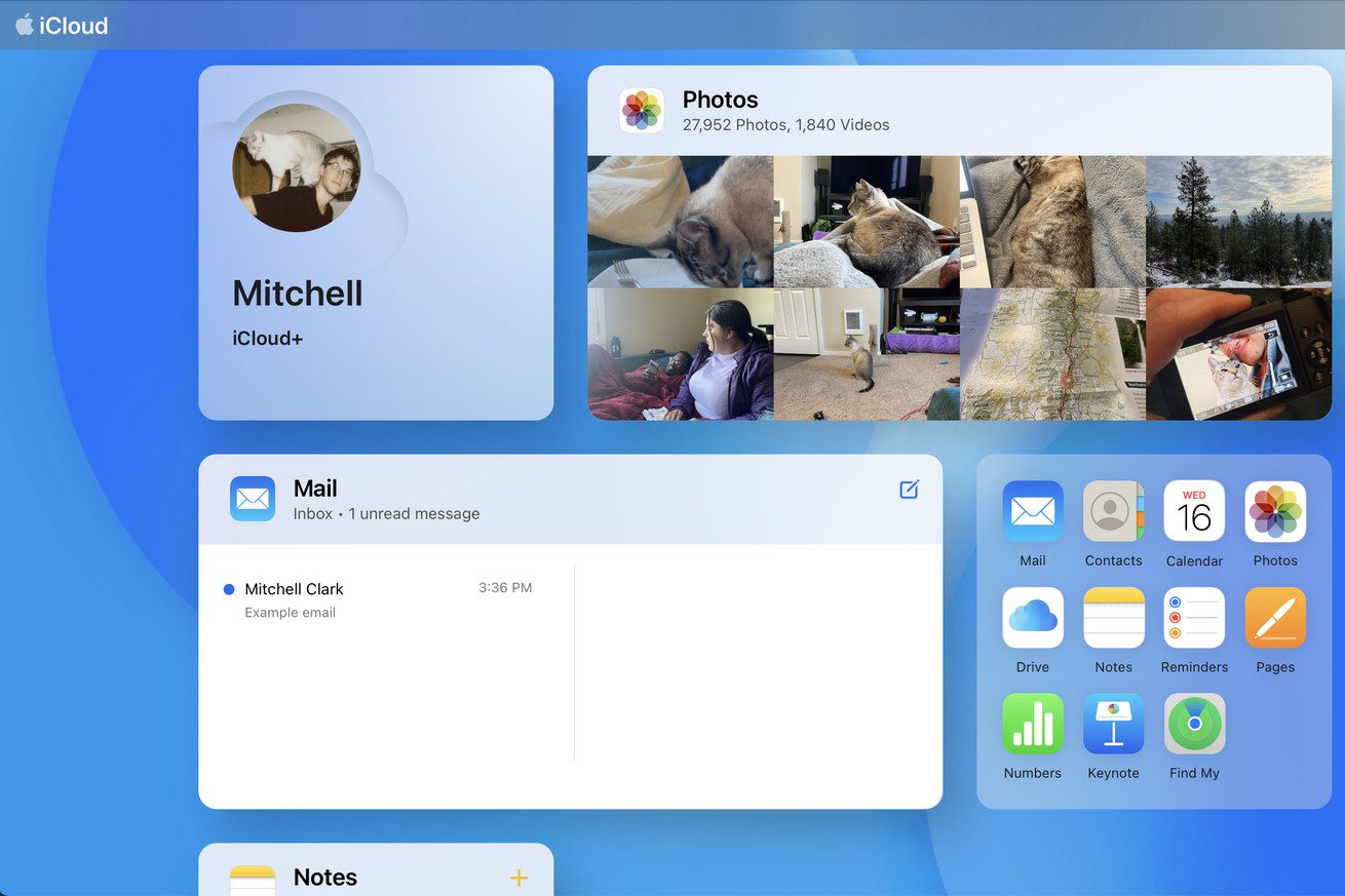
It’s a very new look for Apple’s online portal to your documents, pictures, and more.
Apple has updated iCloud.com to make the site look and feel significantly more modern, adding widget-like tiles that show you information from photos, notes, mail, and more (via MacRumors). It’s a big change from the previous version of the site, which basically just showed a handful of icons that acted as links to web apps, and should be a welcome upgrade for anyone who has to regularly access their iCloud data from a browser rather than an app running on an iPhone or Mac.
With the new design, which was available to beta testers last month, you can customize your iCloud.com homepage, adding tiles that can show your most recent photos, emails, documents, calendar events, notes, and more. Like with most iOS widgets, though, you’ll still…


